Successful businesses like Apple constantly innovate and evolve to become better at what they do. This can even be true in the corporate events industry, as we saw with Apple’s 2022 Keynote, which demonstrated new innovations and trends in broadcast design that could have serious impact on your company’s next big event, should you decide to follow them. Here are some of the highlights that you’ll want to consider incorporating into your future events…
1. Establish a Theme
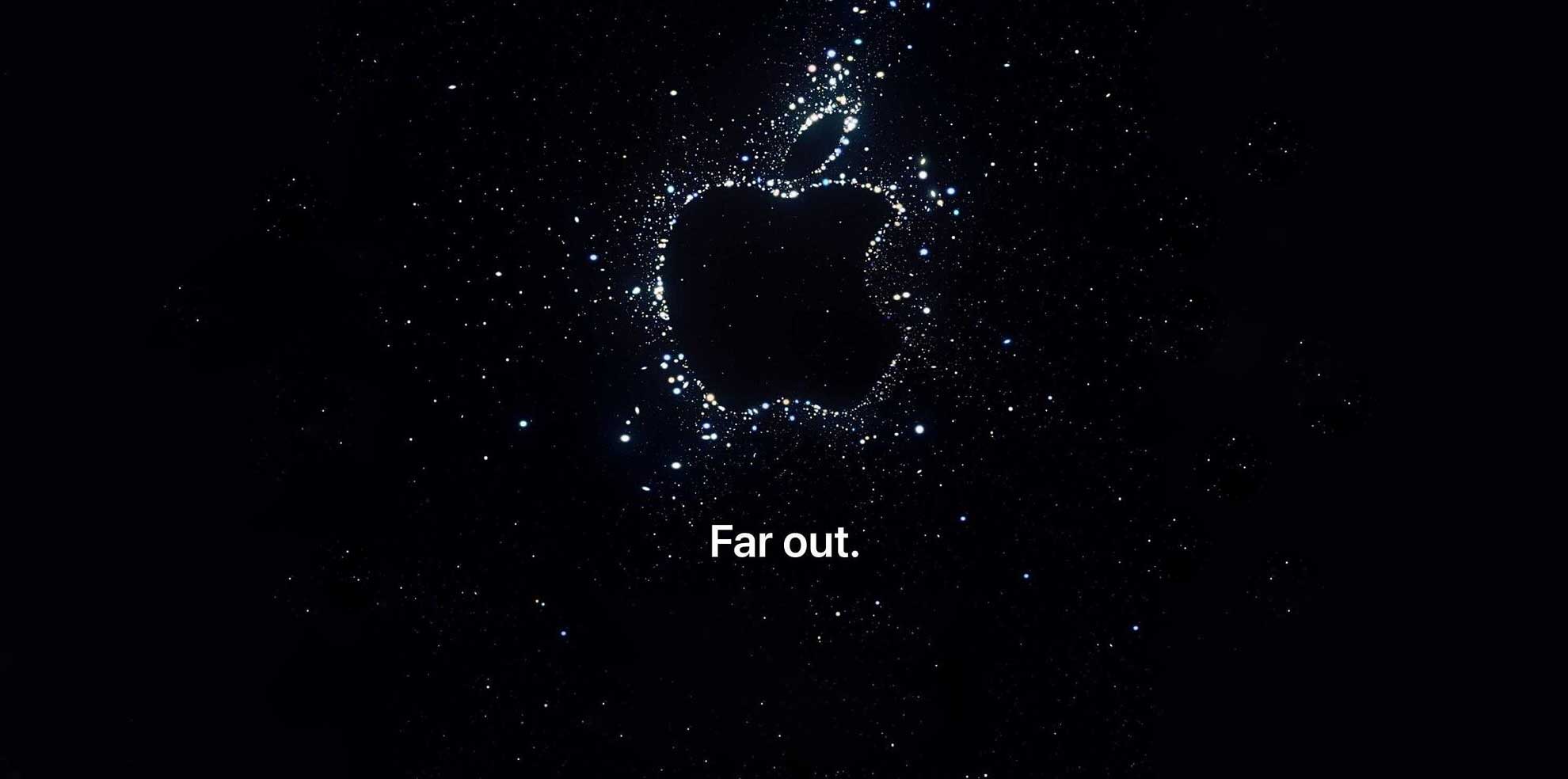
Apple’s Keynote theme, Far Out, was introduced in the atmospheric pre-roll of the broadcast, giving a nod to one of the main reveals—life-saving satellite capabilities and GPS tracking from the Apple Watch to the iPhone. This theme may not be immediately apparent and often, that’s better (dive deeper in our Masterclass on Event Theme’s reimagined).The imagery of stars in the night sky, and the title, “Far Out”, speak to the satellite features that create the atmosphere for this year’s event.
2. Open with the CEO
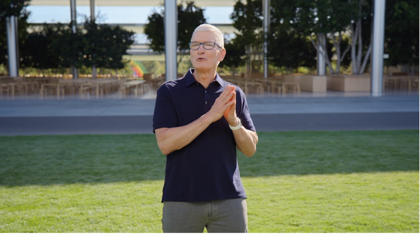
Our clients often ask us if we should open with someone other than their CEO. Like the answer to most questions, the more generic answer would be “it depends”, but the overwhelming recommendation that we provide is, “yes, start with your CEO.” It’s a statement of accountability.
3. Communicate the Mission through Story
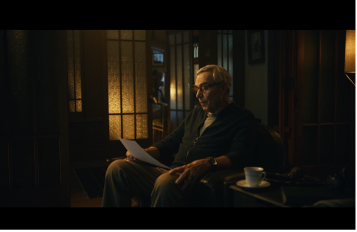
Apple’s Mission of bringing the “best user experience” to the consumer was illustrated in the video montage of real users whose lives were saved by using the innovative technology of the Apple Watch. We meet a variety of users: a blind triathlete, a doctor, a student, a senior citizen, and a blue-collar worker. It’s a diverse group with one thing in common: Apple Watch saved their life. The video showcases pseudo reenactments of these stories as the individuals read the letters that they’ve written to Tim Cook about their experience. This segment grounds Apple’s credibility with their event audience, establishes trust, and captures emotion, all while communicating the life-changing impact on people’s lives through the power of story telling.

4. Implement the Peak-End Rule
The Peak–End Rule is a cognitive phenomenon in which an audience instinctively judges an experience largely based on how they felt at its peak (i.e., its most intense point) and at its end, rather than based on the total sum or average of every moment of the experience. Each topical segment begins with a video that “peaks” interest while not revealing exact details and concludes with a video that reassembles all the prior features. It’s a simple formula that more corporations should embrace in their event design.
5. Include Presenters from Across the Organization
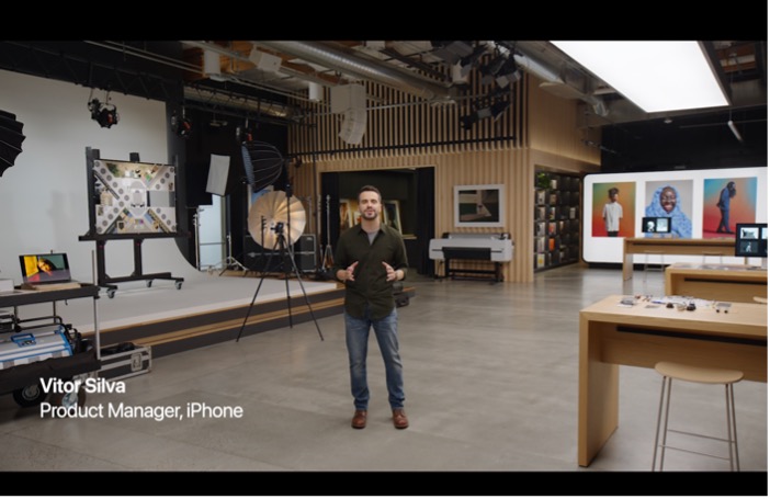
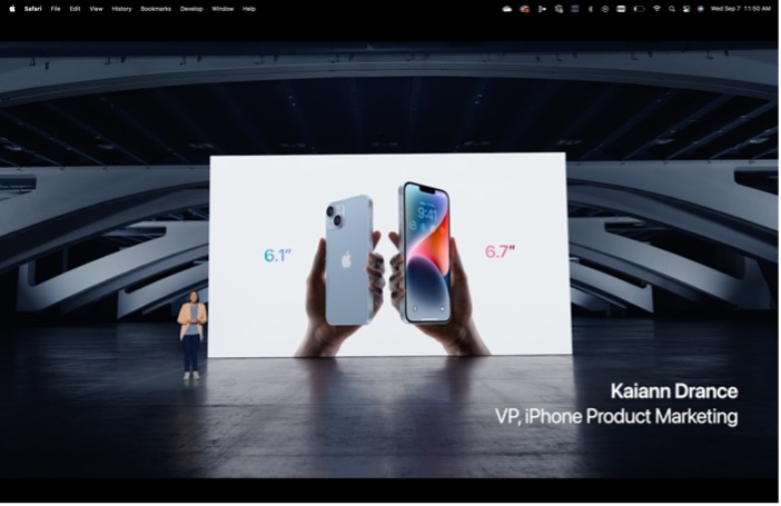
Passing the baton between presenters has become a seminal technique in the Apple keynote flow. The flow goes like this: start with the CEO and COO, go to the Chief Product Owner, to approachable experts and mid-level managers, and back up to Tim Cook to introduce a new product topic. Rather than only involving a parade of executives, a diverse mix of presenters with different roles across the organization were included throughout the presentation—an approach that evokes relatability to Apple’s total consumer base.
6. Connecting Content with Context
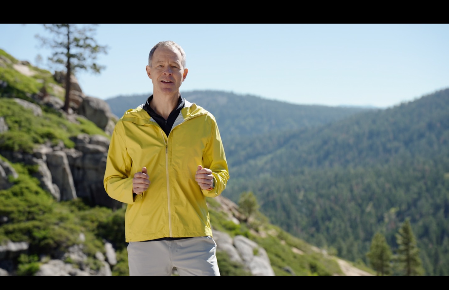
Consider changing up the setting according to the content you’re presenting. For example, Apple COO, Jeff Williams, speaks about the new Apple Watch Ultra designed for the rugged explorer from atop a mountain. Other settings were used with the presentation of the Air Pods moving seamlessly between the subway, to a construction site, to a café. Interesting visuals were incorporated into each segment, from the inside of their office, to a parking lot, to trails and the outdoors to connect with everyday users of all different types, all while reinforcing the company’s focus on the environment.
7. Use Camera Movement to Engage Interest
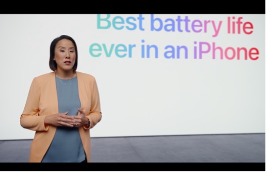
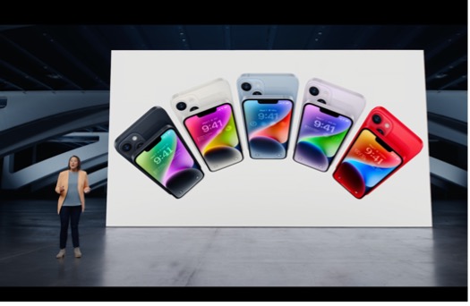
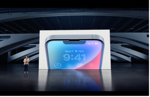
Cameras are almost always moving — whether on a slider or a drone. They keep an additional level of interest through subtle and constant motion and reframing of presenters. The motion from the cameras are both panning side-to-side, as well as zooming in and out, often based on the content and delivery that move from big ideas to up close details. Here’s an example of using the distance between shots to drive interest and grandeur:
8. Utilize Sound Design
One core components of this broadcast design event are the subtle use of sound design often in support of adding some atmospheric and emotional quotient that adds interest. This type of high production touch helps to add a more polished finish to the final broadcast and can help to play into emotional potential that music carries.
A New Breed of Corporate Events
Today’s Apple events are putting broadcast event design on a whole new level, separate from virtual or in-person events, they are a new category of broadcast design bringing high impact and involving months of scripting, production, motion and graphic design, performance coaching, video capture, and post-production.
For larger corporations that are searching for new ways to connect with the changing trends in work to a much greater distribution of remote and hybrid workers, the idea of a corporate broadcast design is something to be considered.
If you’re interested in how these design principles from Apple’s Keynote can help shape your corporate event, contact our team of strategists that design and produce over 100 broadcast events a year, across a gamut of budgets, audience sizes, and industries.


